What is a Footprint Chart and How to Read It?

Ever wanted to see market movements from the inside? To know trading volumes, contract numbers, and the balance of buyer and seller strength? The Footprint Chart can provide you with that insight.
The Footprint Chart, a way of visualizing price movement, was first introduced by Market Delta in 2003. Even though the project declared bankruptcy in February 2020, the Footprint trademark still belongs to Market Delta. As a result, you may find Footprint Charts under different names on various platforms, such as Volume Profile, Bid-Ask, or Delta Profile.
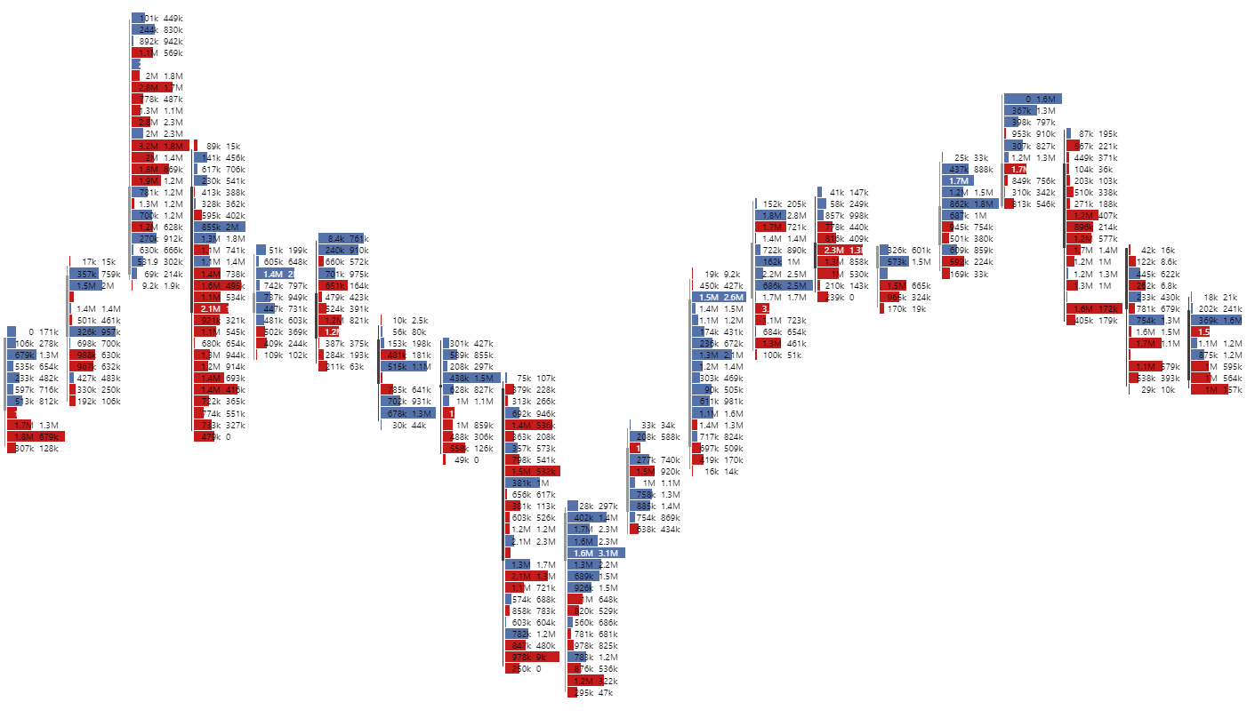
A Footprint Chart is a data display format within each candlestick, showing detailed information about trades, such as the time and price at which they were executed, the volume of buys and sells, and the delta between them. Think of a Footprint Chart like an X-ray: it reveals details that are otherwise hidden.
According to the Cambridge Dictionary, “footprint” refers to “the mark made by a person's or animal's foot.” In the same way, a trader using a Footprint Chart becomes a tracker, analyzing extended data on price movements instead of relying on traditional Japanese candlesticks or bars.

To buy, for example, 1 BTC, someone must be willing to sell 1 BTC. This transaction can happen instantly or over time, introducing the concept of different order types:
In Footprint chart methodology, market participants who use market orders are called “aggressive,” while those who use limit orders are called "passive." Almost every trade is initiated by an aggressor using a market order, which is matched by a passive participant's limit order.
The quantity, volume, and execution price of limit orders can be observed using the DOM (Depth of Market) tool. This tool is displayed as a horizontal table, with sell limit orders at the top right and buy limit orders at the bottom left. The DOM provides real-time data, showing the current interactions between market participants, but not historical interactions.

Bid-Ask data is integrated from the DOM (Depth of Market). However, unlike the DOM, which only shows real-time data, the Bid-Ask Footprint provides historical information about the interactions between buyers and sellers.
Bid-Ask Footprint clusters are typically colored in red or blue (the color scheme can be customized in the software settings). Red indicates more aggressive selling, while blue indicates buying. The color intensity reflects the extent of the imbalance between Bid and Ask.


The best way to understand a Delta Footprint is by comparing it to a Bid-Ask Footprint.

Although Bid-Ask Footprint and Delta Footprint provide the same information in slightly different formats, we recommend using Bid-Ask Footprint since its data is crucial for strategies like finished/unfinished auctions.


There is also an alternative version of the Volume Footprint called the Volume Profile. It provides the same information as the standard version but, in addition to color, the clusters form a profile: the larger the volume, the longer the cluster.

For instance, using a Footprint Chart for cryptocurrency trading offers only a partial view of the market. The data typically comes from one CEX, like Binance, Bybit (See our Bybit review for details), or WhiteBIT. However, trading also happens directly on the blockchain, and with the advent of cryptocurrency ETFs, even on the stock market.
The Footprint Chart is not a silver bullet but rather an additional analysis tool. It should be used alongside other strategies, such as fundamental and technical analysis, Market Profile, or Price Action.
In the future, we will cover the most popular strategies for using Footprint Charts in trading. Follow GNcrypto on Telegram to stay informed about new articles!
A Footprint Chart is a data display format within each candlestick, showing detailed information about trades, such as the time and price at which they were executed, the volume of buys and sells, and the delta between them. Think of a Footprint Chart like an X-ray: it reveals details that are otherwise hidden.
According to the Cambridge Dictionary, “footprint” refers to “the mark made by a person's or animal's foot.” In the same way, a trader using a Footprint Chart becomes a tracker, analyzing extended data on price movements instead of relying on traditional Japanese candlesticks or bars.

OHLC (Open-High-Low-Close) Chart vs Footprint Chart. Left: Japanese Candlesticks, Right: Footprint Chart. Source: exocharts.com.
The Footprint Chart is commonly used to identify supply and demand imbalances, pinpoint support and resistance zones, and confirm trends or reversals in price movement. This visualization provides a clear picture of how market participants interact, though traders may interpret the data differently based on their perspectives, leading to criticism of this approach as subjective.
Before the Footprint Chart
There are several variations of the Footprint chart. Despite their differences, they all share the same goal: providing insight into market participants' interactions. Before exploring the different types of Footprint charts, let's revisit the fundamentals of price movement.
To buy, for example, 1 BTC, someone must be willing to sell 1 BTC. This transaction can happen instantly or over time, introducing the concept of different order types:
- Market orders: These execute immediately at the current price. While execution is guaranteed, the price is not.
- Limit orders: These execute at a price set by the trader. While the price is guaranteed, execution is not.
In Footprint chart methodology, market participants who use market orders are called “aggressive,” while those who use limit orders are called "passive." Almost every trade is initiated by an aggressor using a market order, which is matched by a passive participant's limit order.
The quantity, volume, and execution price of limit orders can be observed using the DOM (Depth of Market) tool. This tool is displayed as a horizontal table, with sell limit orders at the top right and buy limit orders at the bottom left. The DOM provides real-time data, showing the current interactions between market participants, but not historical interactions.
Bid-Ask Footprint
The Bid-Ask Footprint is one of the most widely used variations of the Footprint chart. It shows the number of executed market sell orders (Bid) and buy orders (Ask) at specific price levels. Bids are absorbed by limit buy orders (displayed on the left), while Asks are absorbed by limit sell orders (displayed on the right).

Japanese Bar Chart vs Bid/Ask Footprint. Source: tradingriot.com
Let’s take an example. A Bid-Ask Footprint for BTC shows "720x1650" at the $55,000 price level. This means that during the selected period (which can be set in the software, e.g., 15 minutes), 720 contracts were sold, and 1650 were bought using market orders.
Bid-Ask data is integrated from the DOM (Depth of Market). However, unlike the DOM, which only shows real-time data, the Bid-Ask Footprint provides historical information about the interactions between buyers and sellers.
Bid-Ask Footprint clusters are typically colored in red or blue (the color scheme can be customized in the software settings). Red indicates more aggressive selling, while blue indicates buying. The color intensity reflects the extent of the imbalance between Bid and Ask.

Bid/Ask Footprint with Colored Clusters. Source: exocharts.com
In another representation of the Bid-Ask Footprint, clusters are placed according to Bid and Ask values: red on the right, and blue on the left. The length of each cluster reflects the level of demand (Ask) and supply (Bid).

Clusters Arranged by Bid and Ask Values. Source: exocharts.com
The way Bid-Ask Footprints are displayed is a matter of preference. Traders can choose the version that best suits their strategy (for example, the last version helps highlight areas of greatest interest) or simply based on visual preferences.
Delta Footprint
The delta metric is the difference between executed Bid and Ask orders, helping to identify zones where either buyers or sellers dominate. A negative delta indicates selling pressure (shown in red), while a positive delta indicates buying pressure (shown in green).
The best way to understand a Delta Footprint is by comparing it to a Bid-Ask Footprint.

Bid-Ask Footprint vs Delta Footprint. Source: tradingriot.com
In the example above, the first cluster of the Bid-Ask Footprint shows "75x197." This means that at this price level, 75 Bid contracts and 197 Ask contracts were executed. Important note: when calculating the delta, the bid is always subtracted from the ask. So, the delta for the first cluster is 197–75 = 122.
Although Bid-Ask Footprint and Delta Footprint provide the same information in slightly different formats, we recommend using Bid-Ask Footprint since its data is crucial for strategies like finished/unfinished auctions.
To make it easier to visualize the strength of buyers or sellers, traders use the Delta Profile. Like the Delta Footprint, it highlights clusters with color but also adjusts their length: the larger the delta, the longer the cluster.

Delta Profile. Source: exocharts.com
The combination of Delta Profile and Bid-Ask data display is one of the most frequently used visualizations of Footprint Charts among traders. Delta Profile highlights the dominance of buyers or sellers (helpful for identifying absorption, B-shape, and P-shape patterns), while Bid-Ask helps to determine finished and unfinished auctions, imbalances, and stacked imbalances.
Volume Footprint
Volume Footprint does not show separate Bid-Ask values. Instead, it displays the total number of contracts executed at each price level, regardless of whether they were buys or sells. This type of Footprint Chart is mainly used to identify areas of high trading activity and determine support and resistance levels.

Volume Footprint with a blue rectangle indicating a support zone. Source: tradingriot.com
Clusters in the Volume Footprint can be color-coded. In this case, price levels with higher trading volumes will appear in more saturated colors than areas with less trading activity.
There is also an alternative version of the Volume Footprint called the Volume Profile. It provides the same information as the standard version but, in addition to color, the clusters form a profile: the larger the volume, the longer the cluster.

Volume Profile. Source: exocharts.com
Note the text within the clusters in the example above. Instead of showing the number of contracts, this example uses synthetic volume mode, which takes the asset's value and multiplies it by the number of traded contracts, displaying the volume in U.S. dollars.
Final Words
Footprint Chart data doesn’t come out of nowhere. Before using a Footprint Chart, it's important to assess the data source: is it reliable, and does it fully reflect the asset’s price movements?
For instance, using a Footprint Chart for cryptocurrency trading offers only a partial view of the market. The data typically comes from one CEX, like Binance, Bybit (See our Bybit review for details), or WhiteBIT. However, trading also happens directly on the blockchain, and with the advent of cryptocurrency ETFs, even on the stock market.
The Footprint Chart is not a silver bullet but rather an additional analysis tool. It should be used alongside other strategies, such as fundamental and technical analysis, Market Profile, or Price Action.
In the future, we will cover the most popular strategies for using Footprint Charts in trading. Follow GNcrypto on Telegram to stay informed about new articles!
Recommended


